The Nike City Connect Experience In Baseball Has Been A Massive Failure

Pack it up here Nike, I think we're done. In 2021 we saw the City Connect version of MLB jerseys show up in our life and baseball fans were thrilled. A great new look for your favorite team rocking a jersey that represented your city. It wasn't your classic Yankee pinstripes, your Orioles black and orange, your traditional team look. It was going to be de different and exciting for fans. Well 3 years later I think we can officially say this shit stinks. These jerseys for the most part have been awful and this whole promotion has been a massive failure for baseball and Nike. Simply put, 90% of the jerseys they have come out with are terrible and no one likes them. I was pushed over the edge by the embarrassment that is the Tigers City Connects that came out on Monday.

Advertisement
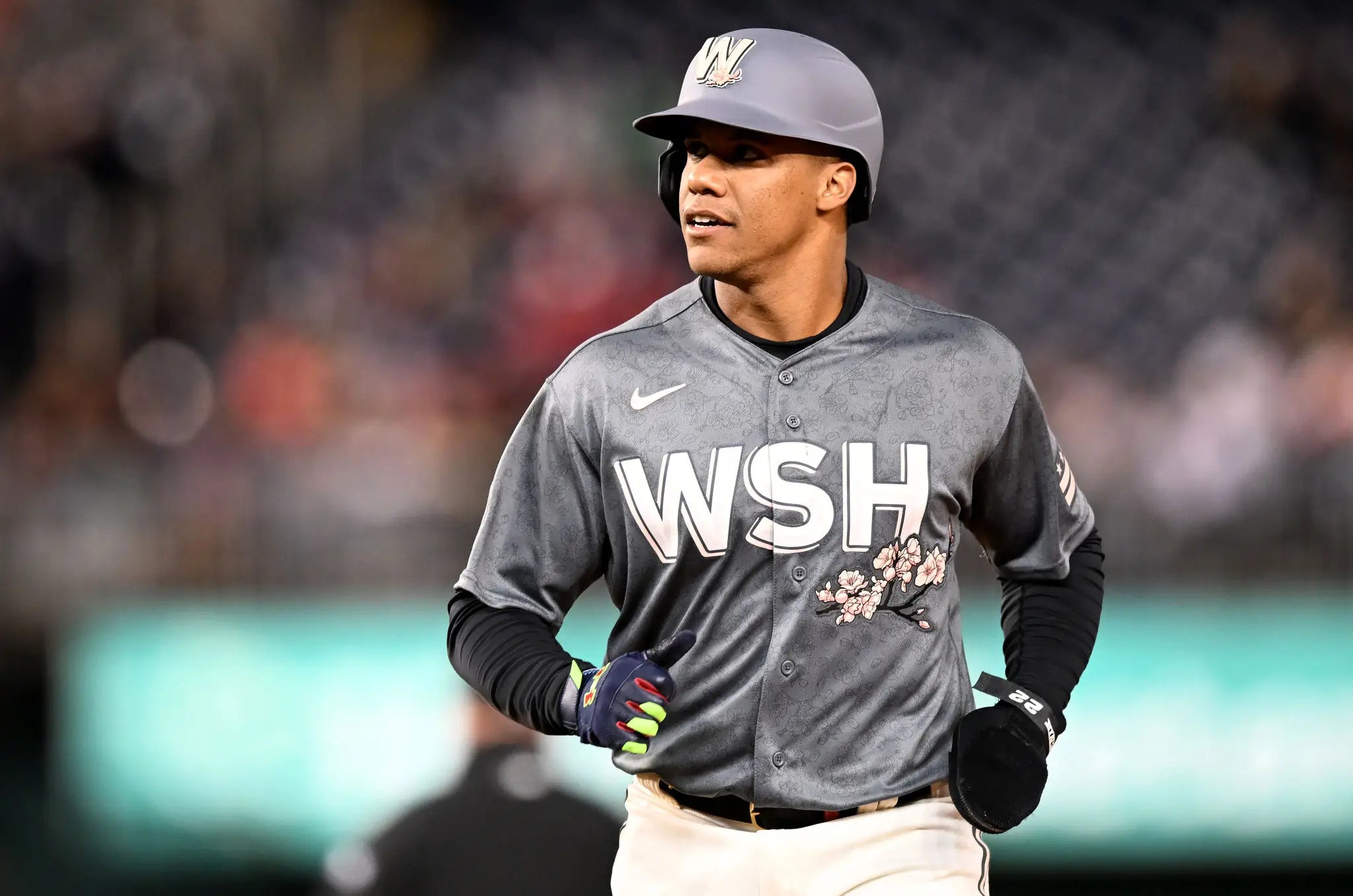
Tire tracks across a jersey? Just a plain old "Detroit" on the hat? F for effort you guys, just a god awful uniform here. And for the most part, that is what we have been seeing. Awful uniforms. This could have been a really cool adventure that baseball and Nike were taking us on, a special non-traditional uniform for each team but it turned into a contest of "who can wear the worst looking jersey while pretending that fans will like it and that it means something to each individual city." Nike and MLB missed their mark sooooooo bad on pretty much all of them. I'll give them props on the Nationals Cherry Blossoms, the Padres ones, and the Rays ones. Those are the only 3 I really like.
 Greg Fiume. Getty Images.
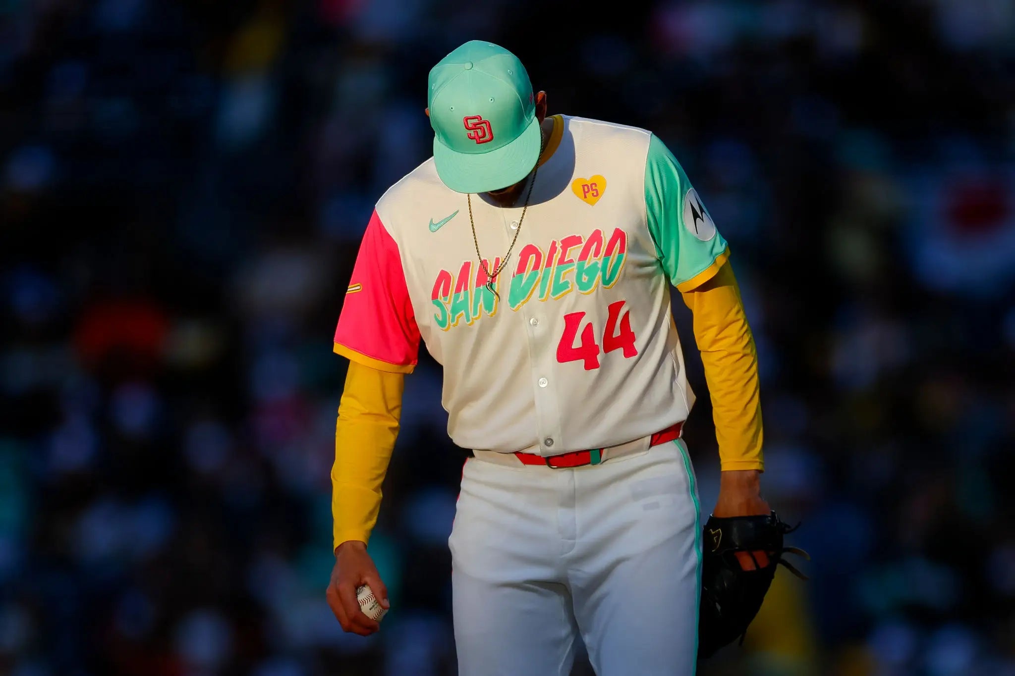 Brandon Sloter. Getty Images.
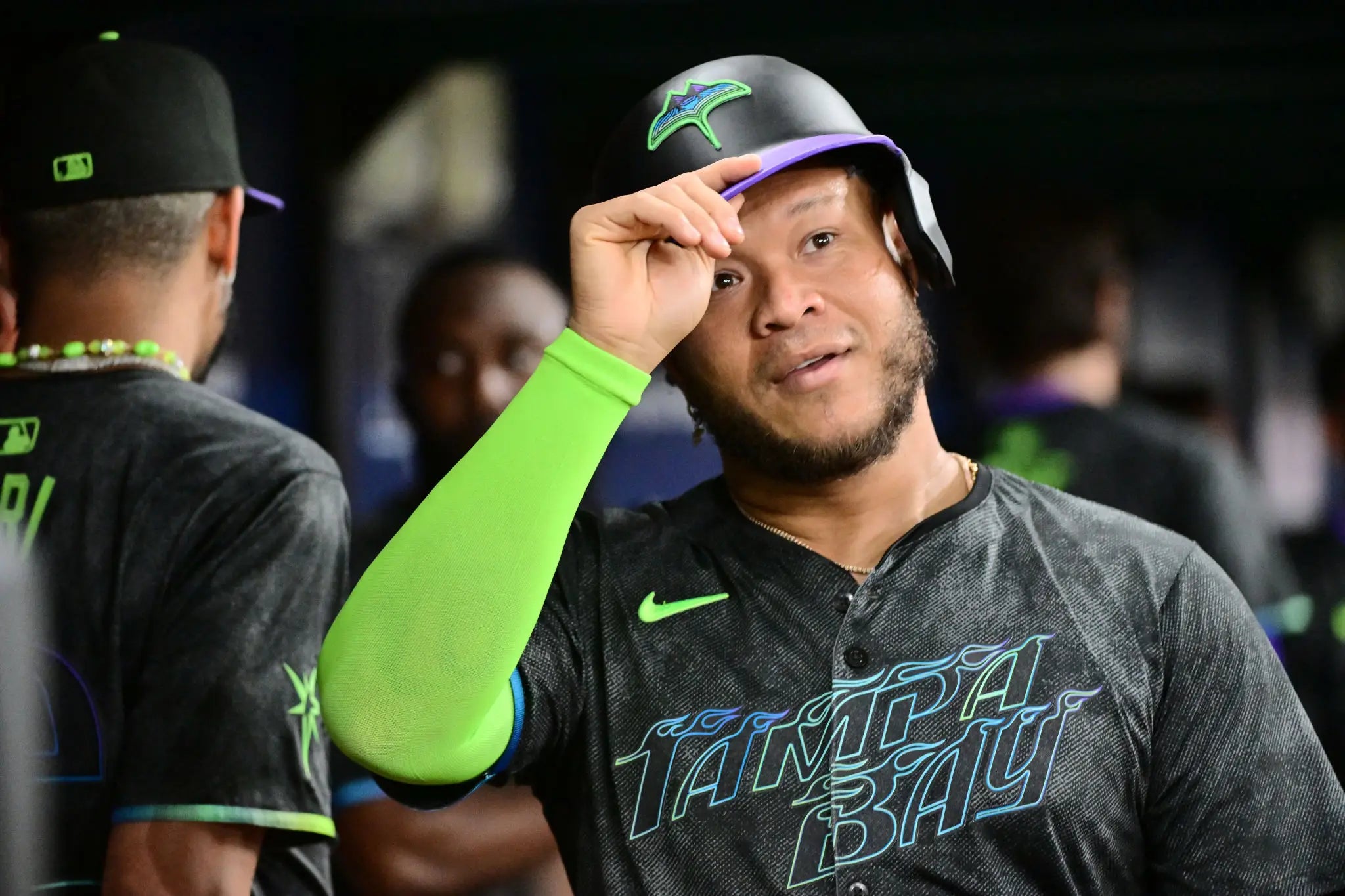 Julio Aguilar. Getty Images.
Advertisement
These 3 are the only ones that can stay, a few of the other ones weren't too bad like the Marlins, Brewers and Astros but everything else should be buried under the garbage. I don't know why Nike and baseball had to try and get all cute with this stuff, give us something the fans would like, the players would like, and something that represented the city and call it a day. They tried to do next level things and failed miserably. Since 2021 they've rolled out a few uniforms every season but they should just end it now. It was a fantastic idea, a great concept that sounded like it would be awesome but for the most part has brought nothing but disappointment from fans.
For whatever reason Nike has been obsessed with one color uniforms, I have a friend who says the Orioles all black City Connects makes them look like a ballet class, everything is one solid color. Dark pants, Nike seems to loveeeee the dark pants to pair with the top. Why the obsession with that? For the most part it's a lack of creativity on all of these. Why the dark colors on every one? Teams have other colors that blue and black. I'm over having to watch a video to understand why the font is that way or to find out the easter egg on the uniforms. For the love of god the O's ones (which I think are okay) have an all black outside with the bright colors on the INSIDE? Make it make sense people!
I'm just over the City Connects, I thought it would be fun but turns out it just sucks. A massive failure in my eyes from baseball when they had a chance to do something very cool. Fans love uniforms, they love the ascetics of a new uniform. They want to go buy it, but with 90% of these they want to throw them right in the trash.
A lot of meat left on the bone with these, a lot. Great idea in theory but god awful execution. Shocked that Nike and baseball has one again dropped the ball on something.